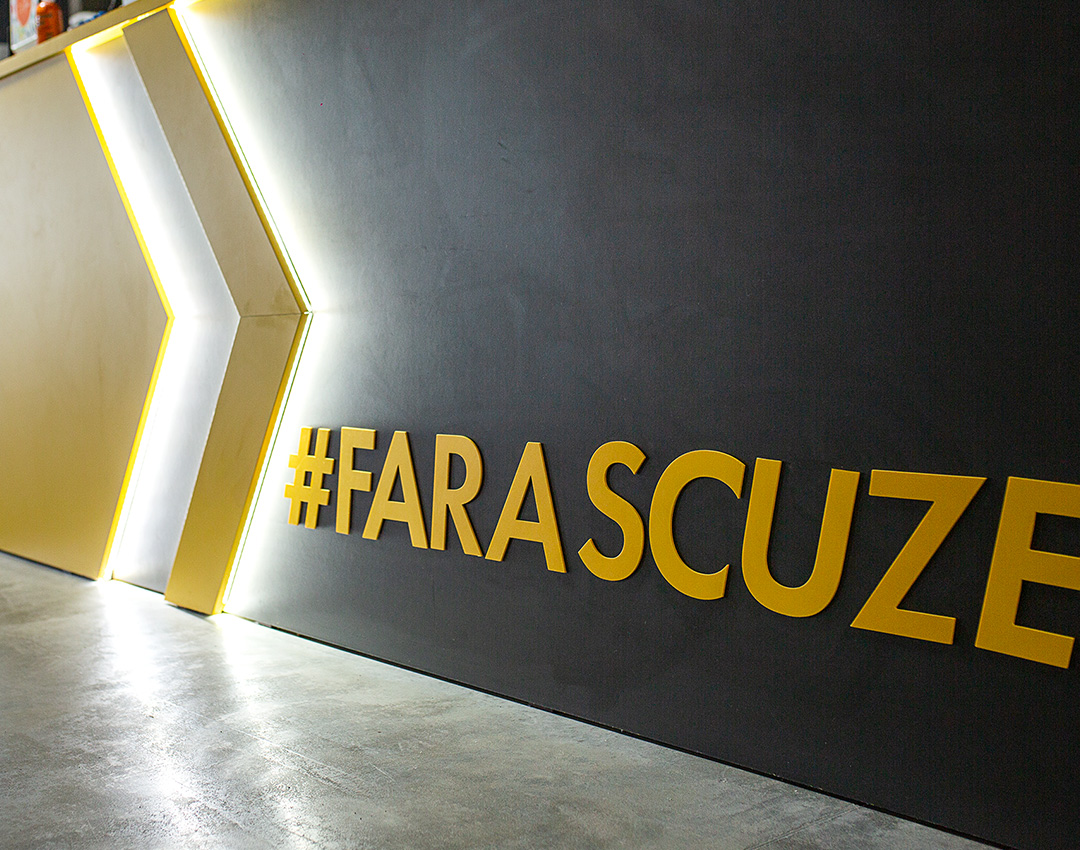
One More is a true promoter of exercise and physical activity as great ways to feel better, boost your health and have fun and their slogan speaks for itself: No Excuses!
Our
Mission
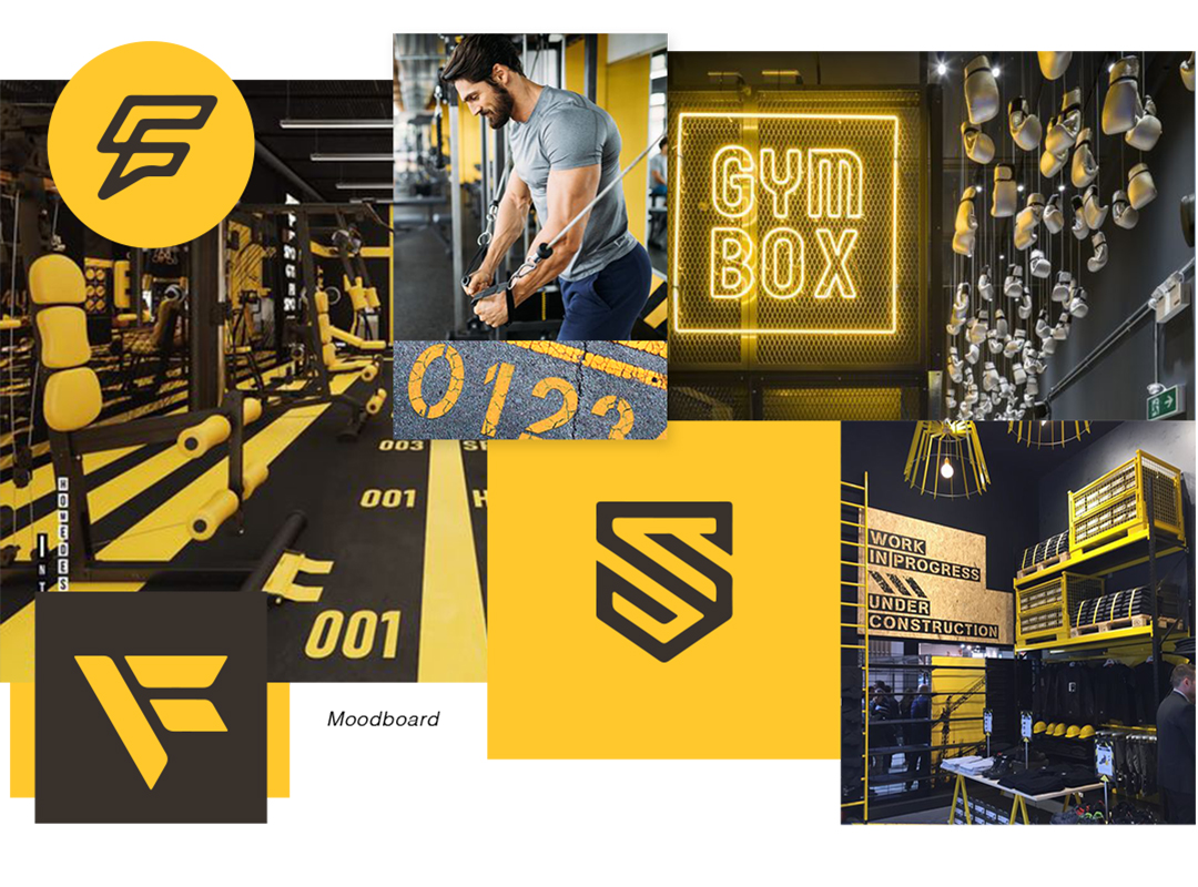
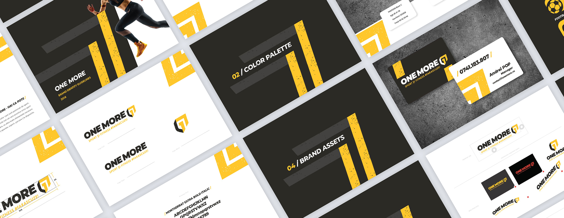
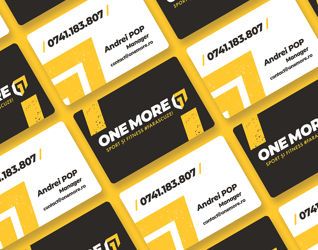
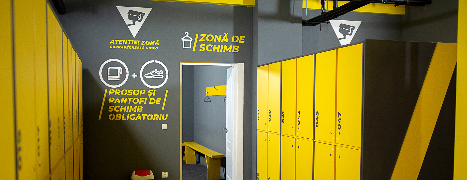
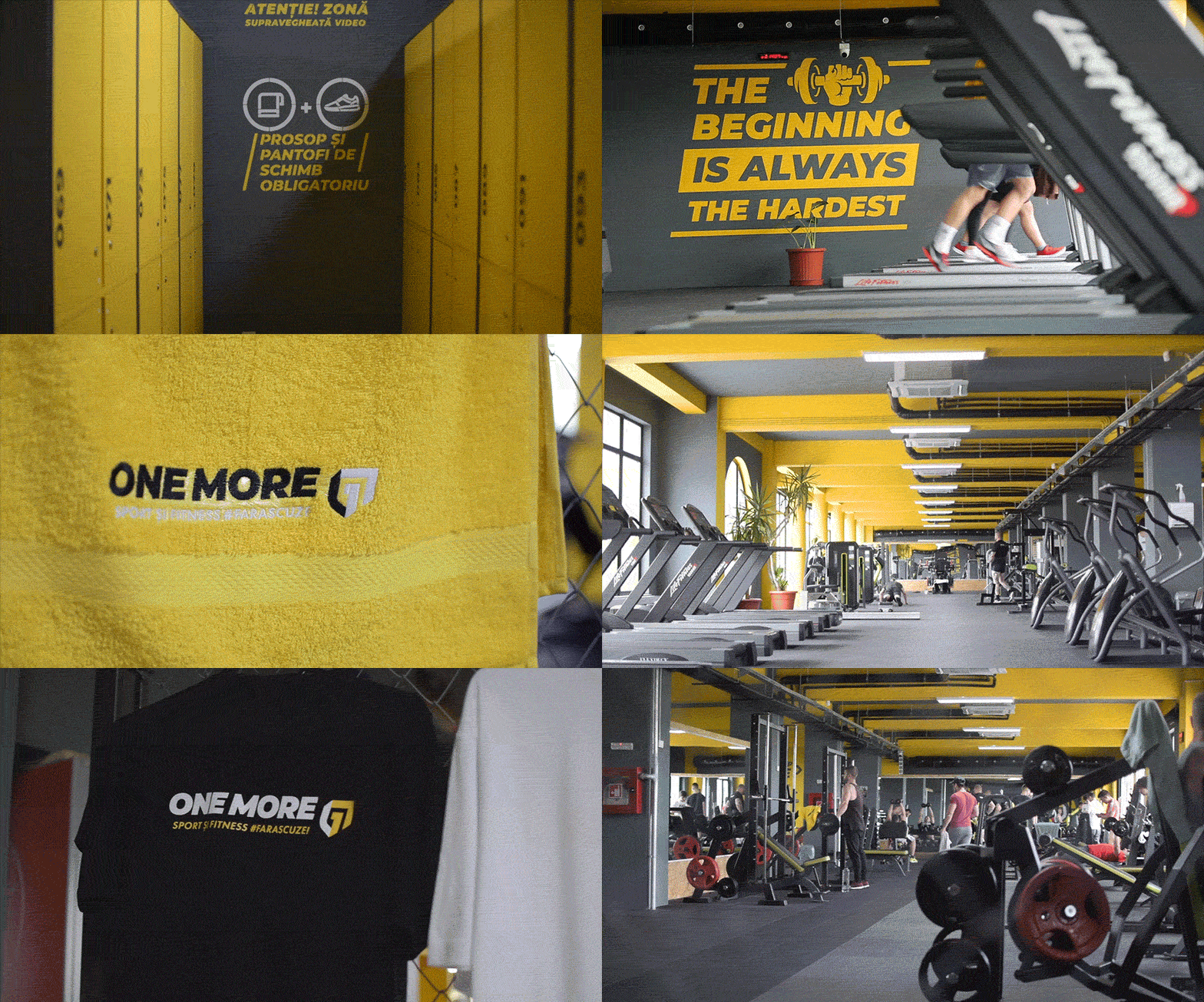
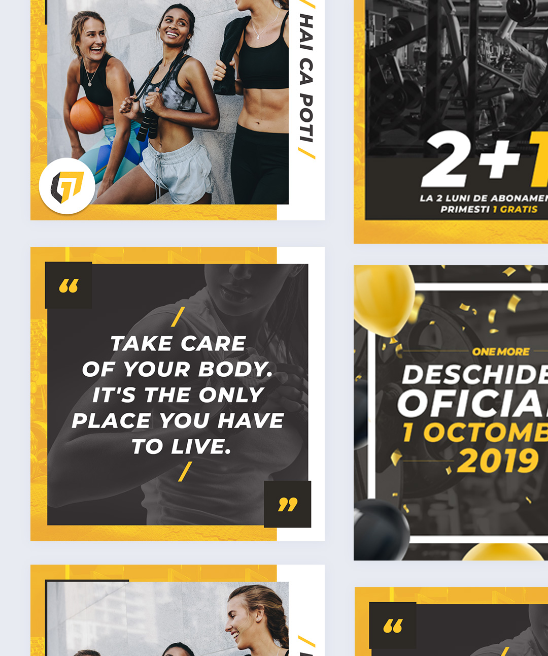
Our mission was to create the visual identity of the brand, while expressing their powerful, active and dynamic personality in a way that would increase their brand recognition at visual level. From logotype, color palette, typography to custom made iconography, we helped One More with their branding, taking into account the usage of these elements, both on digital and printed materials, as well as on merchandise, and their interior.
The
Identity
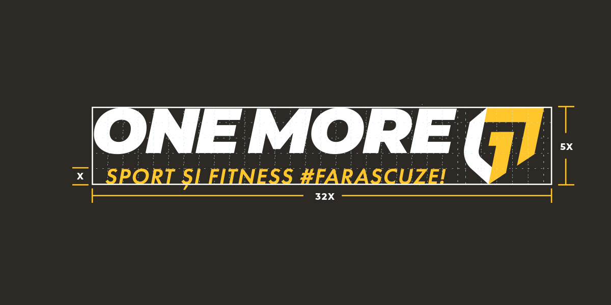
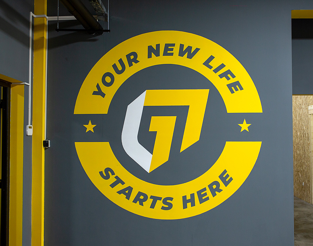
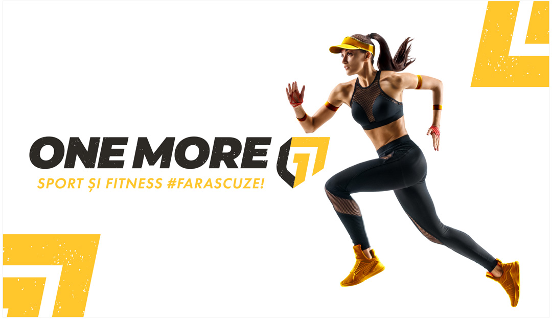
We created the logo based on thick, angular lines that represent their dynamics, and the way it is graphically represented, with a worn-out kind of texture, reflects the brand’s personality which is energetic, industrial, basic. The arrows combined with the number 1 suggest their will of not giving up, their will to continue exercising, training, etc.
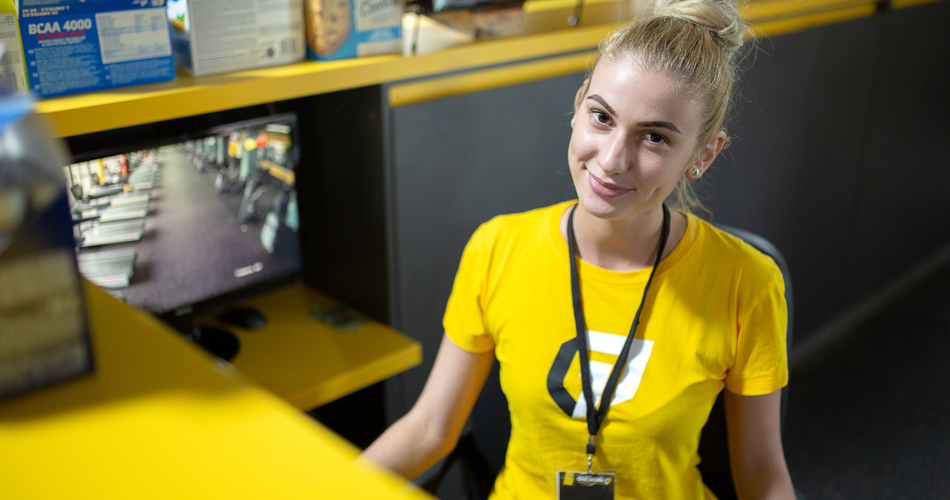
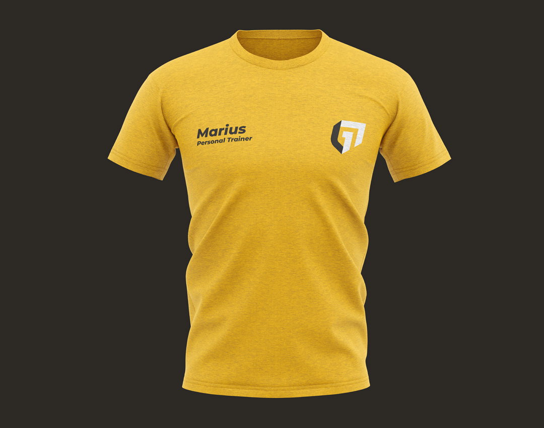
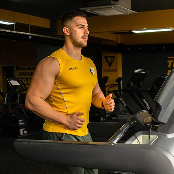
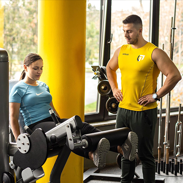
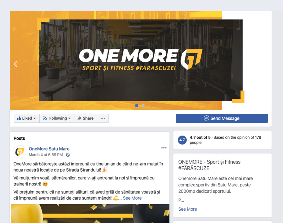
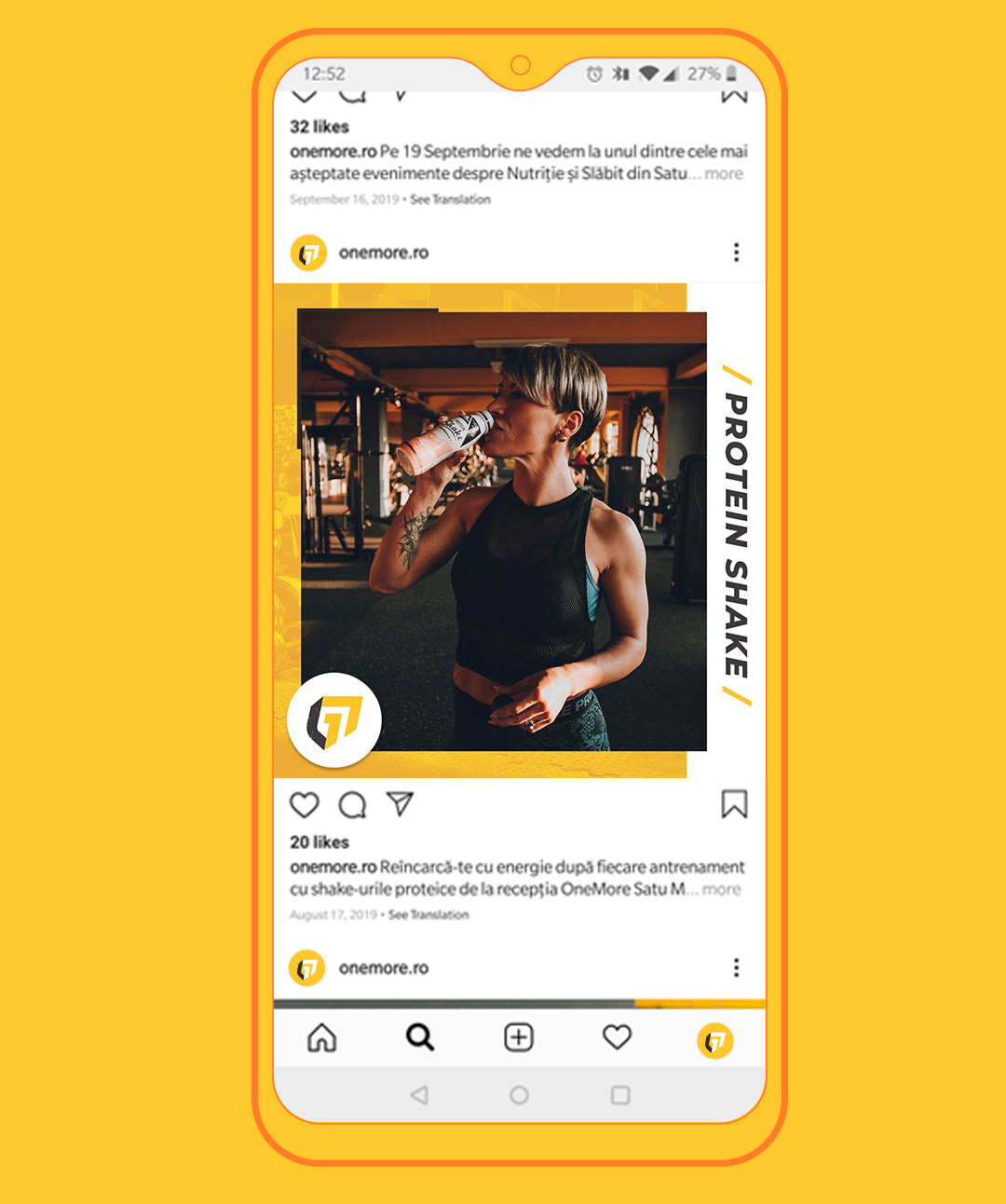
Using a strong font, next to the chosen color palette yellow for energy and positivity, we managed to visually reflect the vision and the core of the brand. Considering that it is an offline business with online presence, we paid special attention to all designs that transformed into prints, stickers or merchandise such as T-shirts or training suits.
The
Result
It is not the project itself that gives us great satisfaction, but the people we get to work with and the fact that we contribute to creating local communities, driven by the same motivators which in this case, were sports-related. Having extra photoshoots with the One More team every now and then makes us think that they really enjoyed our collaboration.
