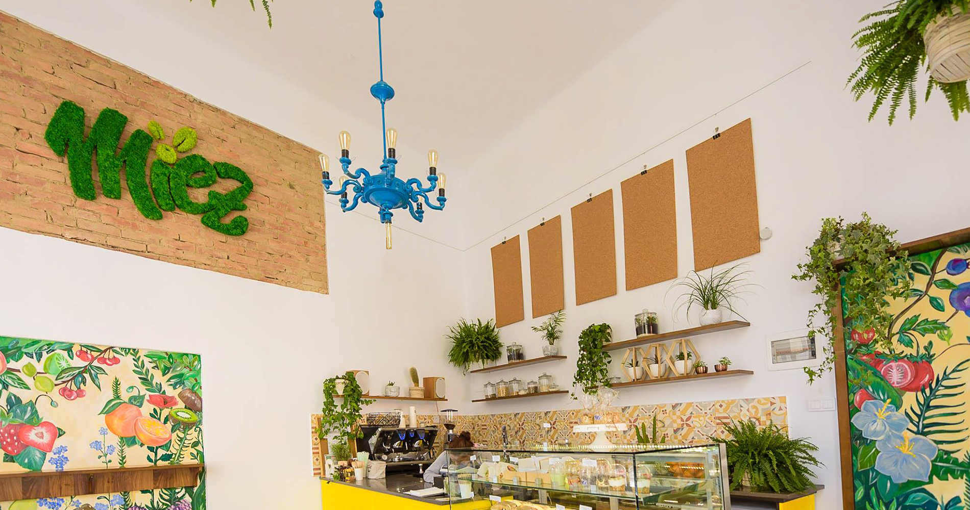
Miez’s main concern is that the recipes they offer are made from clean products, without syrups, sugars or artificial ingredients. At the same time, their constant thought is to reward the environment and nature for what it gives us.
Our
Mission
Our mission was to help a great, cool local brand communicate their core values to the targeted audience through their brand – from logo, visual identity to lettering, collateral designs and even eco-friendly packaging. In a market where more and more people become aware of the healthier lifestyle they need, we wanted to contribute in making Miez more visible and loved by the local community.
The
Identity
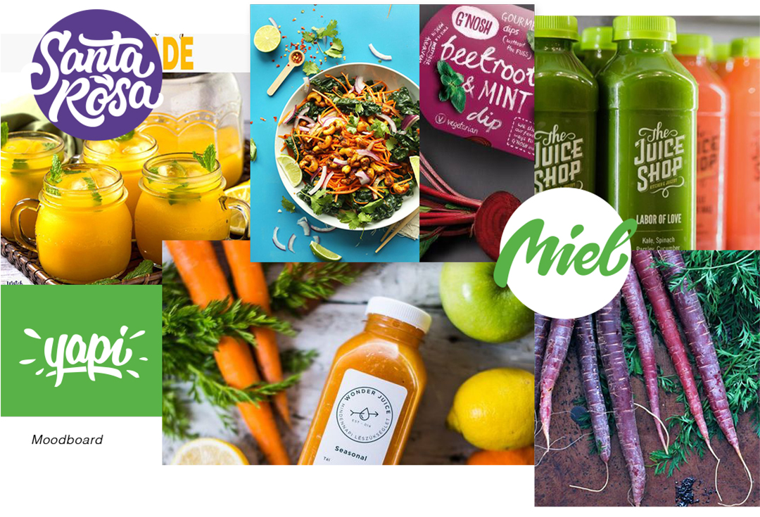
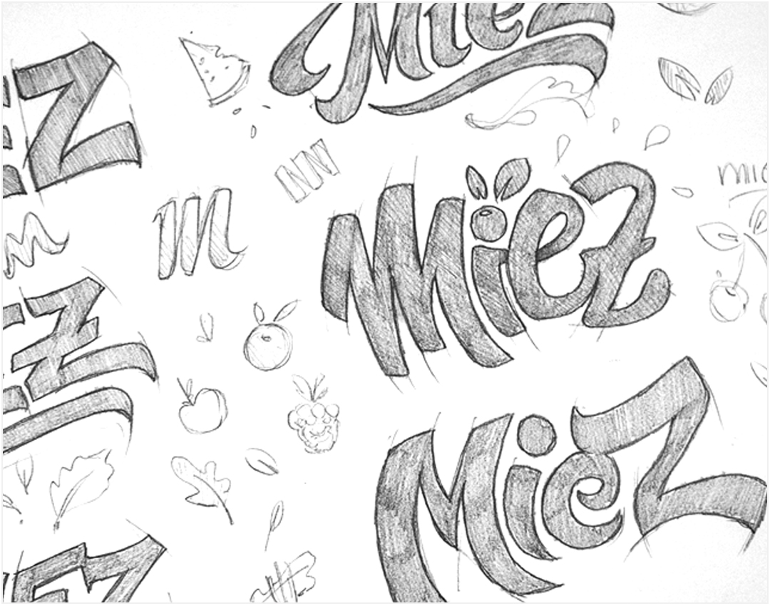
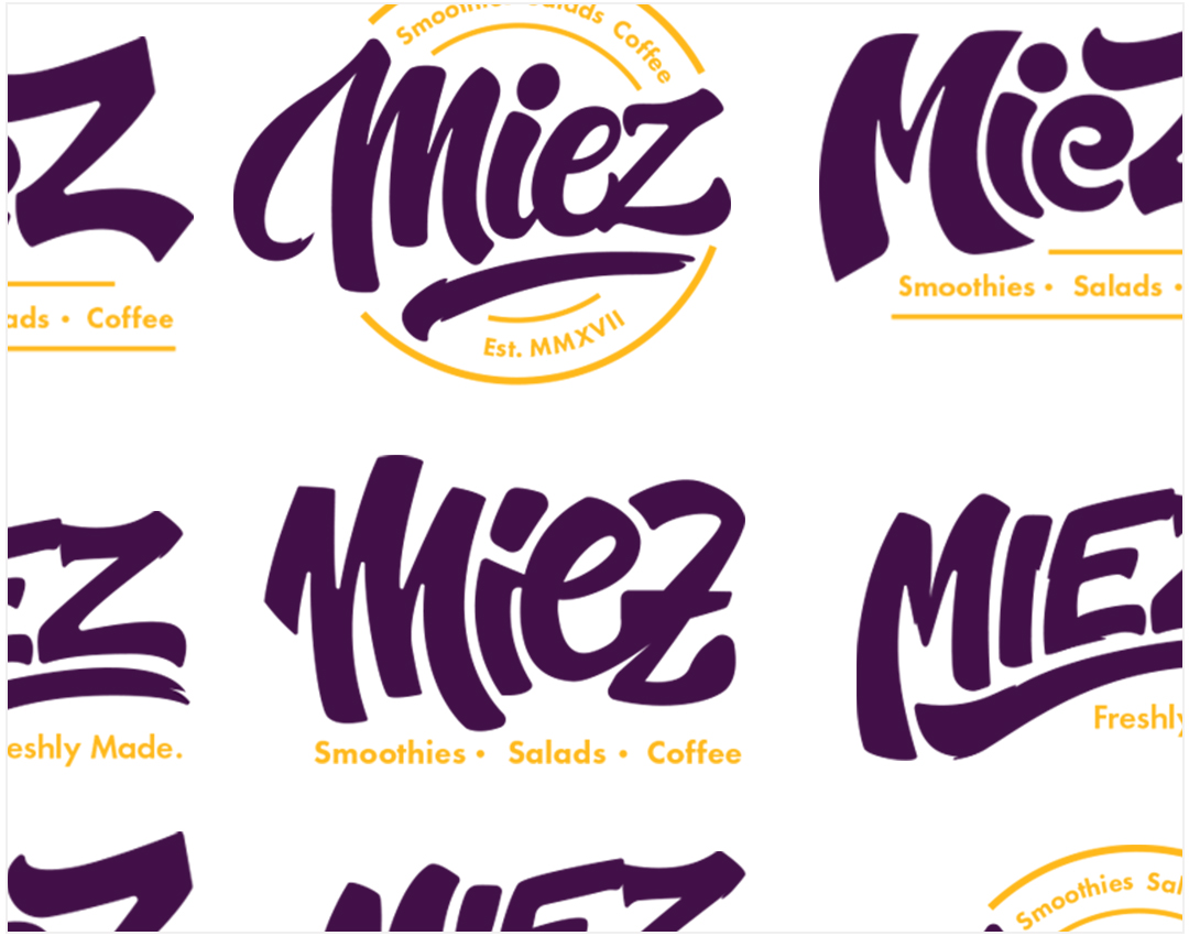
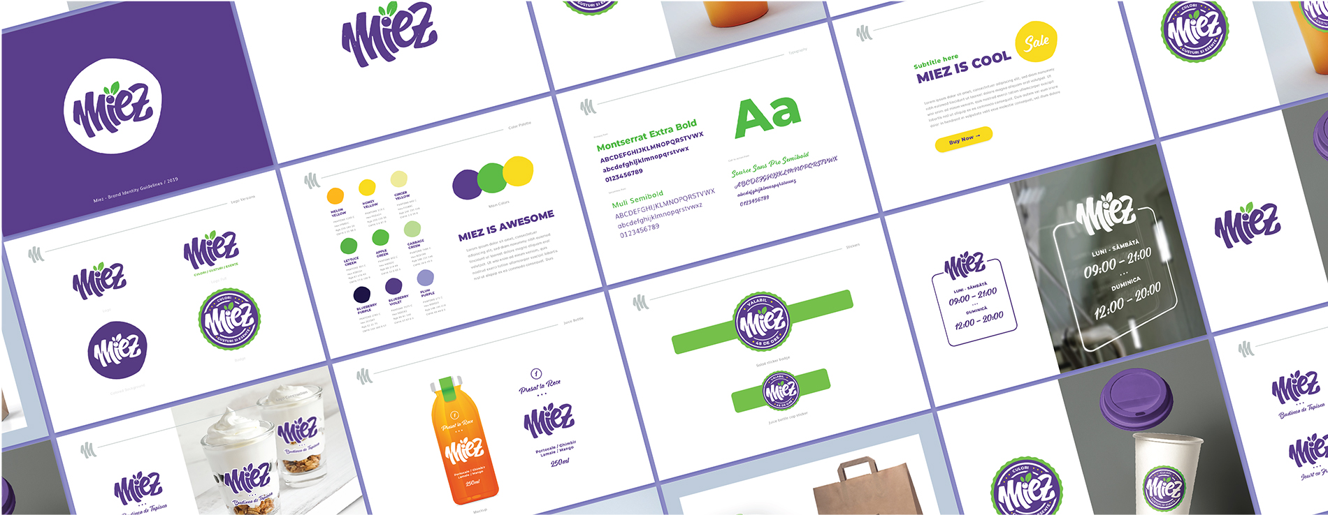
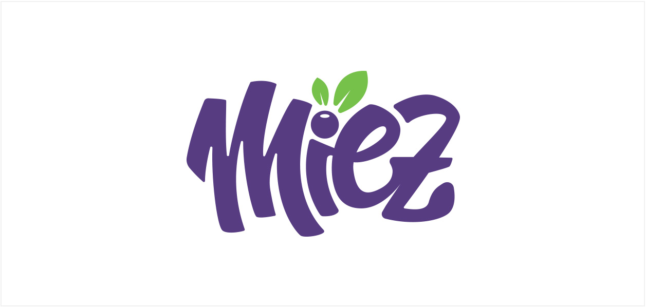
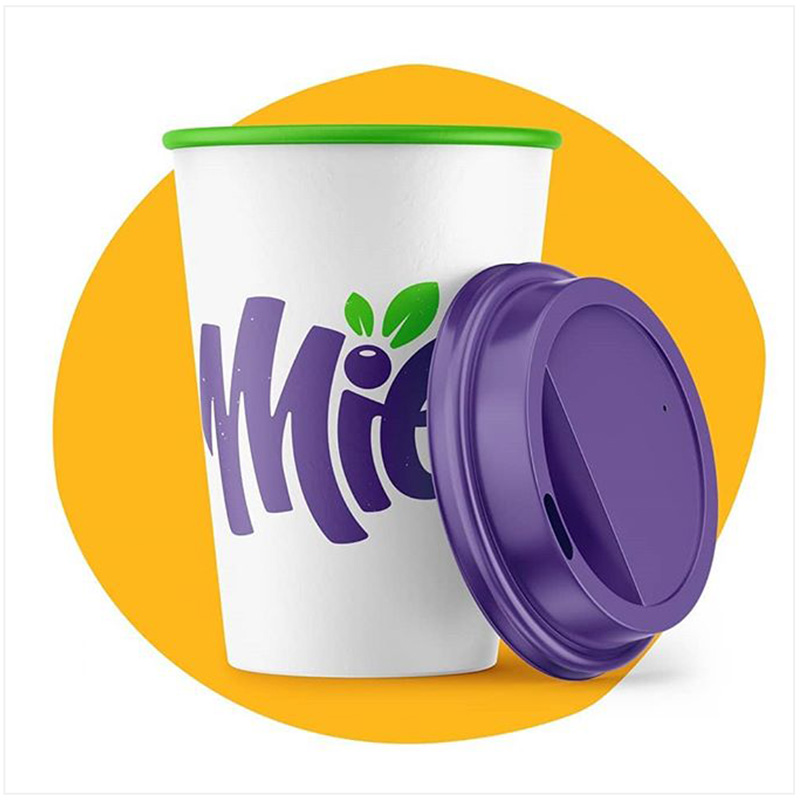
With such a strong brand vision, it was clear for us from the beginning that natural elements could not be missed out when designing the logo. The blueberry was the perfect fit, together with a pair of tiny leaves, both as an element of the logo, and as main color, pairing great with nature’s green. The lettering was needed as no existing font could illustrate the personal touch that the brand has in its customer’s lives.
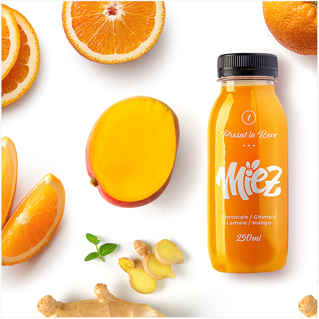
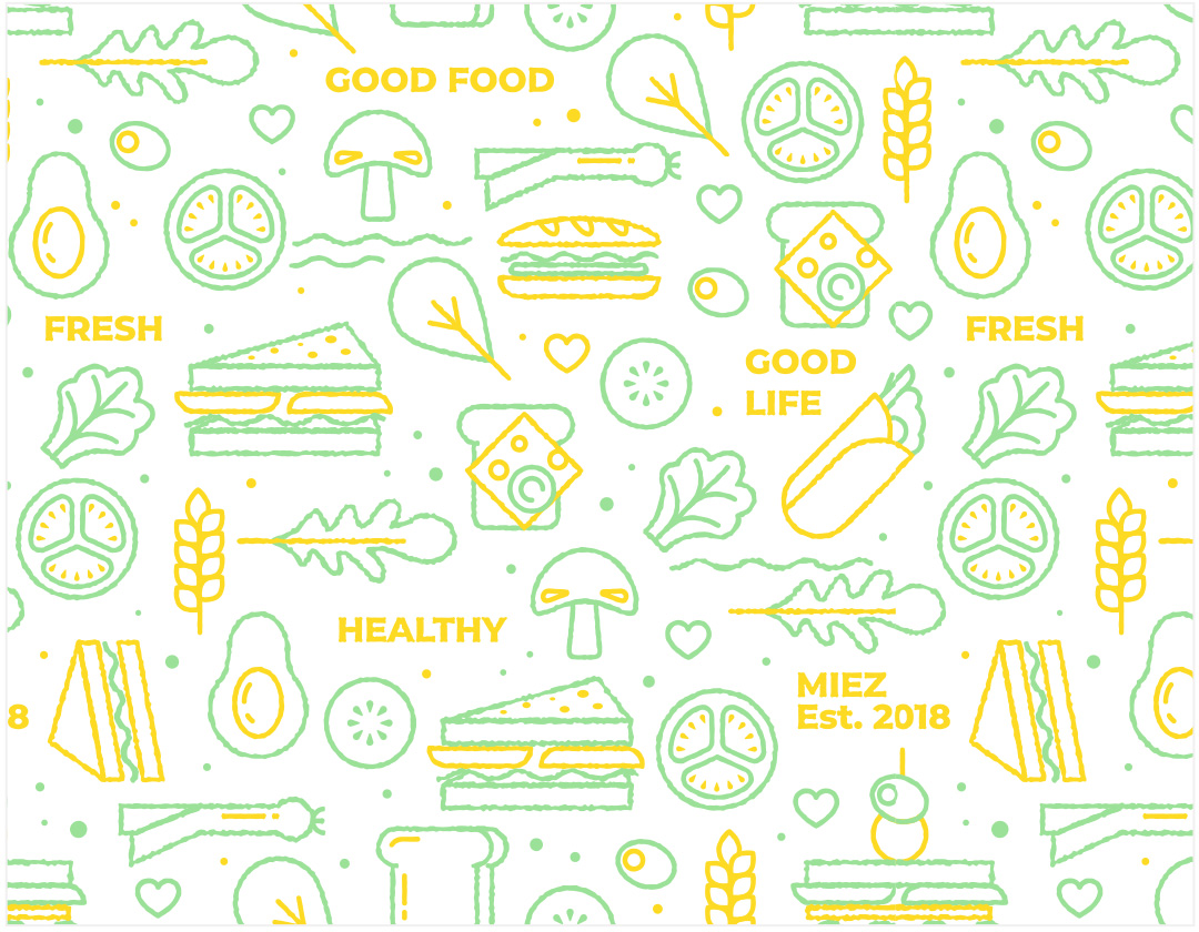
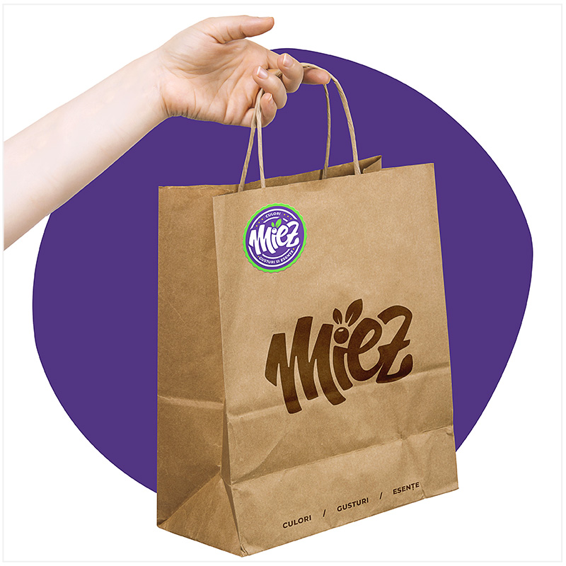
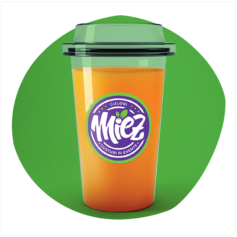
The brand needed a fresh, young and urban identity, so the color palette of blueberry purple and nature green got along the orange. Having established these, the next step was to design different printed materials, from food and drinks packaging to different prints needed in the bistro.
The
Result
Handling the identity for Miez was more than creating some designs, but putting together all the needed elements that communicate its true core: what the brand wants to become, what is its commitment towards customers, how we want the brand to be perceived and what are the competitive advantages. Having happy customers and noticing that people around us recognize the brand is the best reward.
